Branding
Good branding is at the forefront of every successful business. It is the best way to make a memorable impression and allows your customers and clients to know exactly who you are and what you can offer them. Whether you're a new start up looking for direction, or an existing business looking for a fresh and cohesive new look - I can help. See some examples of my previous branding work below. I offer branding packages which you can read all about here. Not sure what it is you need? Get in touch


01
Coach Corey
Corey came to me wanting a logo for his new football coaching business. I provided a number of initial designs before deciding on this one, which we then tweaked and played around with the colour palette to produce this final design. This one was a lot of fun to work on, and as for his business? It's going from strength to strength! Check him out on instagram at @coach_corey1on1
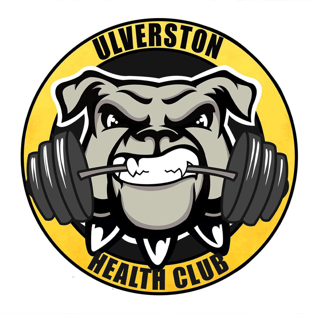
02
Ulverston Health Club
For this project, my client already had an existing logo which was poor quality, outdated and well deserving of a re-work. Keeping the same theme and ideas, I re-created the logo and brought it back to life using bold colours and an American sports style logo design. I love how this turned out. If you have a logo that could do with some love, please don't hesitate to get in touch.

03
Pets Pillows
My client wanted an illustrative logo creating for her new pet bed business. She specifically requested a German Shepherd and Tabby Cat to be featured on it in some way which was a really fun challenge. We chose a calm colour palette to help empathise the calming nature of her product and I love how it turned out.
04
HB Studio Photography
My client came to me wanting a logo for her photography business but not being sure what it was that she wanted. After discussing the future plans for her business and providing lots of initial designs, we landed on this one and tweaked it to make it perfect for my client. She couldn't decide between these two colour palettes so decided on both! To see some really beautiful photography, find her on Instagram at @_hbstudio


05
Fatboithin
This project was both challenging and a lot of fun. My client came to me with a very specific idea of what he wanted for his weight loss journey logo and it was such a pleasure bringing it to life. I love designing in an American sports badge illustrated style, it really helps the artwork stand out and it's an opportunity to go bold with colour that I really enjoy.
06
Lakeland LED
Based in the beautiful lake district, my client wanted something that would capture both their surroundings and what the business is at a glance. I loved combining these two elements together and working with colour and typography to create a main and secondary logo as well as an icon and wordmark to be used across all platforms. For all your lighting and electrical supply needs check them out at https://lakelandled.co.uk/


07
Kate Sadler Counselling
Inspired by the benefits of being outdoors on our mental health during a difficult lockdown period, my client had the unique idea to set up a counselling business with an emphasis on talking specifically in the outdoors which I think is just a genius idea. It was therefore important to Kate to have a solid 'nature' element to her branding whilst keeping it clear, simple, calming and approachable. The final logo, I believe achieves just that.
08
Lakeland Stonework Ltd
James came to me wanting a logo for his stone-walling business, based in the Lake District. He had a specific interest in using this unique stone circle design in his branding but needed help pulling it all together. After some initial designs and some revisions, we decided on this final look. I then produced a main logo, secondary logos and business cards to create a consistent and cohesive brand look across the board.


09
Luna Loves Bee
My client Becca wanted a new logo for her custom card business to help sell her beautiful designs on Etsy. She wanted something dainty and unique with the incorporation of a bee an absolute must. I had such fun creating this logo and incorporating a moon and bee into it alongside the typography and it was a total pleasure working on something a little different. Becca received main, secondary, type and icon logos.
10
Fylde Coast Marketing
A start up marketing company came to me seeking a logo to help kick start their new venture. As my client was based on the Fylde coast, I incorporated the Blackpool tower and bold typography in tones of blue to really highlight the coastal location of this company. Unfortunately due to independent issues the project didn't continue, but I am still really proud of the logo concept we created and I think it's important to champion all branding projects, no matter the outcome.


11
Blissful Bairn
Simplicity is key. The cutest muted logo design for a start-up baby clothing and accessories business. My client wanted something simple, soft and muted with a recognisable icon and I definitely feel we achieved just that. Using a playful font and illustrative icon, it helps to enhance the playful and childlike nature of the brand, whilst staying clean and professional looking. The rainbow icon is something that can also be used across a lot of different platforms.
12
JW Fielding
Jake came to me with a sketch of a logo he wanted creating for his business. I thoroughly enjoyed taking that sketch and helping to bring it to life with the right font, clean lines and detailing. I chose a contrasting but bold colour scheme of navy, orange and white which really helps the brand stand out. If you're interested in learning some fielding and supporting a local business, check him out on Instagram at @jwfielding.


13
Kwick Kit
Branding project for an activity kit hire company. For this project I went for a simple clean logo with emphasis on the double K, that could be used as an overlay over their incredible kit photography. I chose a contrasting lime and navy colour scheme for the main logo itself to stand out whilst still linking with nature. Sometimes simple and bold is the best way to make an impact.

14
Royal Campers
My client wanted a slick, premium looking logo to accompany their new premium campervan hire business. They specifically didn't want reference to campervans in their logo, and instead wanted something much more simplistic. I created a monogram by overlapping an R and C in slimline font to create a unique icon. The matte black with gold foil colour scheme really helps to enhance the premium look and feel of their brand.


15
Holly Beauty
Holly came to me wanting a logo to help kick start her solo venture into the beauty industry. She wanted to incorporate a feather into her logo to emphasise the calming nature of the treatments she would have on offer and a blush and rose gold look to make sure it stayed true to her. I really enjoyed working on incorporating these things into her design and love the way it turned out.